Ad Specs
For Minority Nurse, Social Media, Web & Banner Ads, & Email Blast Ads
Minority Nurse Magazine
Mechanical & Production Requirements
| Size | Width | Height |
| Full Page Trim Size Image Area Bleed |
8" 7" 8.25" |
10.75" 10" 11" |
|
Two-Page Spread |
16" 16.5" |
10.75" 11.25" |
| Half Page Horizontal Vertical |
7" 3.4" |
4.5" 9.2" |
| Quarter Page | 3.4" | 4.5" |
- Tiff, PDF, or EPS files only
- All Fonts and logos embedded
- 4-Color (CMYK) Files at 300 dpi
- Greyscale files at 200 dpi
- Line art at 1200 dpi
Example:
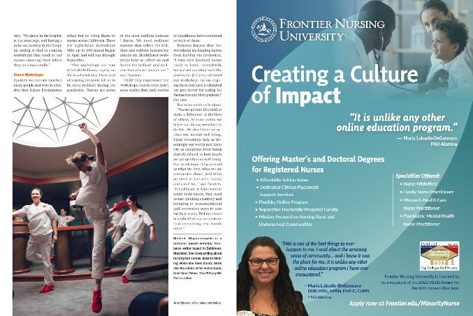
Deliver these items six (6) business days before send date. Please submit FINAL artwork/material. *Advertisers are responsible for the proper format and optimization of the materials they submit.
Social Media Ad Specs
Display Ad Requirements
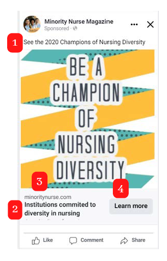
- Include A Headline To Contextualize What You're Promoting: 40 Characters Max
- Link Description: 15 Characters
- Masked URL: A shortened version of the URL for people to see
- URL for redirect: The URL people will be sent to
- Minimum Size 600 x 600
- Recommended Image Sizes: 1200x628 (Desktop), 1080x1080 (Mobile), 1080 x 1920 (Story)
- The square format is best if only one creative can be made
- Image File Type: jpg or png
Video Ad Requirements
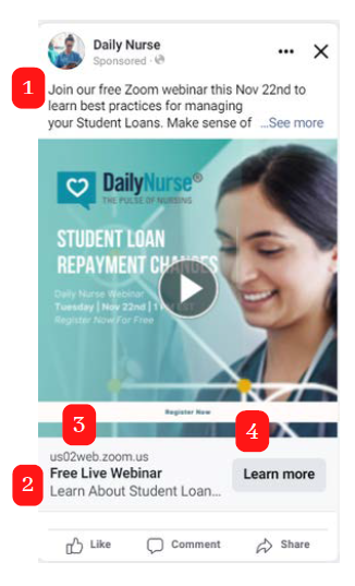
- Include A Headline To Contextualize What You're Promoting: 40 Characters Max
- Link Description: 15 Characters
- Masked URL: A shortened version of the URL for people to see
- URL for redirect: The URL people will be sent to
- Minimum Size 600 x 600
- Recommended Image Sizes: 1200x628 (Desktop), 1080x1080 (Mobile), 1080 x 1920 (Story)
- The square format is best if only one creative can be made
- Image File Type: MP4 or MOV
Web/Banner Ad Specs
Design Requirements
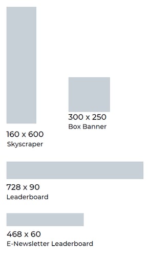
- 160 x 600 Skyscraper
- 300 x 250 Box Banner
- 728 x 90 Leaderboard
- 468 x 60 E-Newsletter Leaderboard
Max File Size 150kb
3rd Party Tracking Available
Careers In Nursing Sponsored Page - Ad Specs
Design Requirements
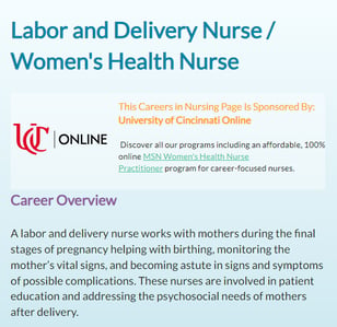
- High Quality (png/jpg) 250x250 square format logo
- 150 character blurb/description for product/program
- 350-500 character blurb/description for product/program

Email Ad Specs
Design Requirements
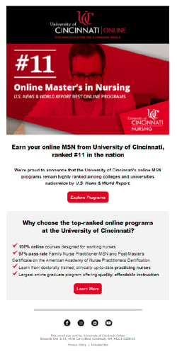
- Maximum width: 600 pixels
- Recommended length: 600 to 800 pixels
- Maximum collective images size: 300 kb
- Use HTML and/or in-line CSS styles
- No image maps; slice the image, put into tables
Delivery Checklist
Deliver these items six (6) business days before send date. Please submit FINAL artwork/material. *Advertisers are responsible for the proper format and optimization of the materials they submit
- HTML file
- Subject line
- Zipped folder/Dropbox file containing all images (required). We upload the images from
your email to our server. - Suggested send date and time
- Suppression list
- Seed list
HTML Guidelines / Tips
Layout and Design
- Maximum Dimensions. Recommended maximum dimensions: 600 x 600–800 pixels. The maximum width is 600px, but can be greater in length. This ensures the email looks overall acceptable across multiple email platforms.
- Responsive/Mobile-Optimized Designs. We do accept mobile-optimized/responsive blasts. With the increase in the mobile audience, we recommend designing your blast with that in mind. Be sure to test your HTML email before submitting the final artwork.
- Easily Clickable. Increase your click-through rate and customer satisfaction with “call to action” buttons and links that are large and easy for the user to find.
- Keep it Simple. Simpler designs, such as a single column, work well across more platforms. The more complicated the design, the more you need to test and debug.
Layout and Design
- Maximum Collective File Size. When saving images, use PNG or JPG format. Recommended collective size of all image files: 40kb. Keeping the image size low keeps our emails loading quickly. Maximum collective size of all image files: 300kb (required).
- DPI and Files Size. While there are not exact standards for image resolution for the web, 72 ppi/dpi (pixels/dots per inch) is recommended. A higher dpi is used for print design, and can increase your file size. We recommend keeping file sizes less than 1MB. Larger files load slowly in your subscribers' inboxes, and nobody wants that.
- Avoid Background Images. Background images are not fully supported across email clients and will not display for all users.
- Avoid Image Maps. Image maps rely on technology that is not supported in many email browsers. This means that some subscribers may not even be able to click on your email at all. Instead of using an image map, slice up the image and place it in a table (an easy option in most design software). This will also increase the deliverability and response of your email.
- Animated Gifs. Be aware that animated gifs are not fully supported across email platforms, and most will display only the first frame of the animation. You can use GIF format if you need to retain transparency, but keep in mind that this format supports fewer colors. That is, a GIF can be good for a logo or icon, but you'll want to stick with PNG or JPG for photos and other images that use a lot of color variety.
- Image Sizes. When you're saving images, you should take into account any padding or margin styles in the campaign template. For example, in a template that's 600 pixels wide that includes 20-pixel padding, a full-width image would only need to be 560 pixels wide. We recommend width of 560px. You may be able to estimate the size.
- Pre-header area: 560px
- Body area for 1 column templates (no sidebar): 560px
- Social bar and utility bar: 560px
- Header: 600px o Body area (with sidebar): 350px
- Sidebar: 160px o 2 column: 260px
- 3 column: 160px
- 4 column: 110px
- Footer left: 370px
- Footer right: 170px
- Color Mode or profile. Colors used online are different from those used in print, so it's important to make sure the colors in your image are set correctly. Web images should be saved using the RGB color profile or mode. CMYK, which is what designers use for print, doesn't render accurately online and in some cases, can actually break your embedded image.
- Be Careful With Spliced Images. If you have a larger image that is spliced and placed into your HTML using table cells or img tags right next to each other you will need to test thoroughly. Some email clients may add extra space between your images. Using “display:block” in your style code can usually remedy this.
Optimizing and Deliverability
- Responsive/Mobile-Optimized Designs. We do accept mobile optimized/responsive blasts. With the increase of the mobile audience, we recommend designing your blast with that in mind. Here are some articles and resources to help you get started:
- “Mobile-Friendly” Designs. Even if you don’t have the resources to build a“responsive” blast, there are some
- Make sure your text is large and easy to read.
- Make sure your images are clear with a small file size (and no wider than 600px)
- Make your layout simple, such as a single column
- Make all of your buttons at least 44-46 pixels wide and tall for easy finger-tapping
- High-Density Screens. Many smartphones, tablets, and laptops feature high-definition screens, such as retina displays, that offer a higher ratio of pixels per inch. This means that images may appear fuzzy on these displays. To make sure your images appear clearly on all screens, you can save your web-ready images at double the size needed for the image block you're using in your campaign. For example, if your header image is 600 x 200, you can upload a 72 ppi image that is 1200 x 400 pixels.
- Increase Deliverability. Check out our recommendations for increasing deliverability. We comply with CAN-SPAM legislation and run a spam check on every email before sending it out. If your email triggers a high rating, we will work with you to make the necessary adjustments.
- Increase ROI. For tips on how to increase the ROI on your email blast, read these
articles: - More Tips. Here is another quick Guide to HTML Email Design.
School Showcase Specifications
How to make the most of your page
Directory Needs
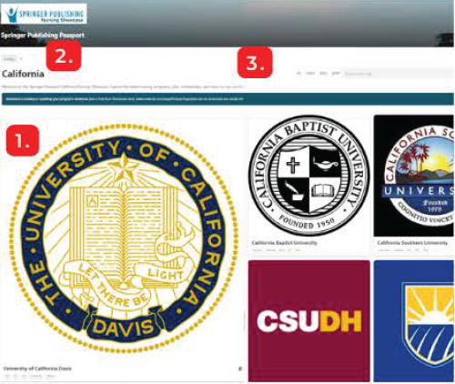
- Logo Of School - 600x600 Pixel Image (.PNG or .JPG) - For Representation Of Your School On The Directory Pages.
- Program Location - State (In Person), Online, or Both - For Search and Categorization.
- Types of Programs Offered - BSN, MSN, & DNP - For Keyword Filtering
School Page Needs
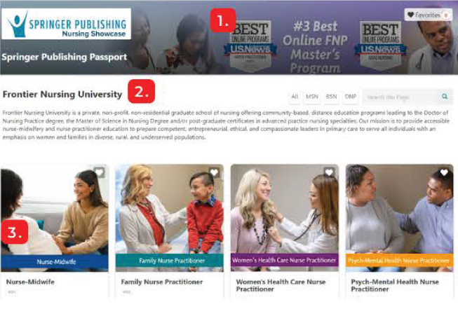
- Header Photo - 3000x500 Pixel Image With No Text (.PNG or .JPG) - For Branding Your Page, The Photo Will Be Featured At The Top Of Your School's Page and Will Be The First Thing People See After Clicking Through To Your School.
- Overview of School - 1 Paragraph Description of Your School - For placement on your schools main page, Visitors of your showcase will be able to view this description under the header image.
- Program Tile Images - 600x600 Pixel Images (.PNG or .JPG) - For Representing The Programs You're Offering. They Should Include Brand Specific Image And Contain The Program Name Within The Image; Color Coding The Programs Is Recommended But Not Required.
- Contact Us Links - Links To Inquiry Page, Webpage, Or Email - For Easy Access To Your Most Important Lead Generation Pages.
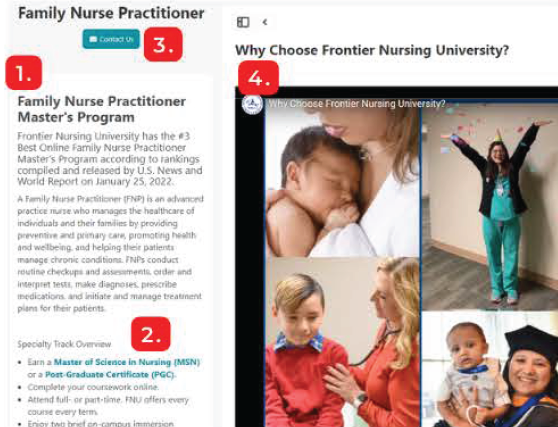
Program Page Needs
- Description For Each Program - A Written Description of The Program, Its offerings, and It's Features - For Use On The Program's Page, Description Should Include Any Important Links And CTAs.
- Keywords for Each Program - Any Highlights Or Search Terms Your School Would Like To Associate With Your Program - For Searchability and SEO functions.
- Embed Code for Inquiry Form - Simple Form Embed Code, Branded For Your School - For Capturing Leads And Any Other Data.
- Videos For Each Program - Embed Code - To Featuring On Your School's Program Page.
Hospital Showcase Specifications
How to make the most of your page
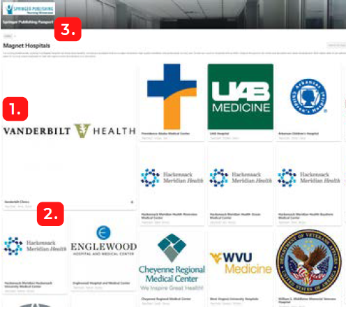
Directory Needs
- Hospital Logo- 600x600 Pixel Image (.PNG or .JPG) - For Representation Of Your Hospital On The Directory Pages.
- Hospital Location - For Search and Categorization.
- Hospital Focus - Magnet or Other
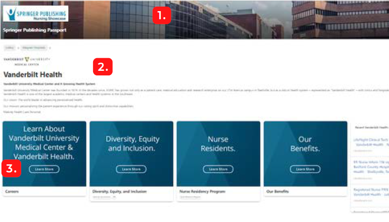
Hospital Page Needs
- Header Photo - 3000x500 Pixel Image With No Text (.PNG or .JPG) - For Branding Your Page, The Photo Will Be Featured At The Top Of Your Hospital's Page and Will Be The First Thing People See After Clicking Through To Your Hospital.
- Overview of Hospital - 1 Paragraph Description of Your Hospital - For placement on your Hospitals main page, Visitors of your showcase will be able to view this description under the header image.
- Information Tile Images - 600x600 Pixel Images (.PNG or .JPG) - For Representing The COontent You're Sharing. They Should Include Brand Specific Image And Contain The Information's Title Within The Image; Color Coding The Tiles Is Recommended But Not Required.
- Embed Code for Inquiry Form - Simple Form Embed Code, Branded For Your Hospital - For Capturing Leads And Any Other Data.
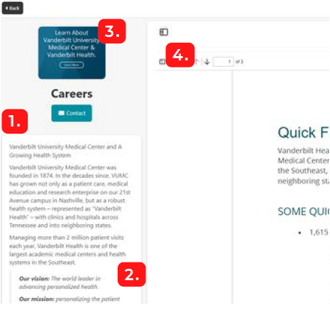
Offering's Page Needs
- Description For Each Information Page- A Written Description of what you're sharing, Its offerings, and It's Features - For Use On The Landing Page, Description Should Include Any Important Links And CTAs (Aside From The Main Contact Link) Inline.
- Keywords for Each Page - Any Highlights Or Search Terms Your Hospital Would Like To Associate With Your Pages - For Searchability and SEO functions.
- Contact Links - Links To Inquiry Page, Webpage, Or Email - For Easy Access To Your Most Important Lead Capturing Pages.
- Video or PDF For Each Page - Embed Code - To Feature Content On Your Hospital's Page.
Sponsored Podcast Specifications
Podcast Sponsorships for 'Conversations about Healthcare Delivery in the US' podcast
Podcast Homepage: https://info.springerpub.com/conversations-about-health-care-delivery-in-the-us
30 seconds pre-roll audio ads
Supported file formats:
Free plan: mp3, m4a
The recommended stereo bit rate and sample rate for audio files:
Stereo Bit Rate: 128 kbps
Sample Rate: 44.1 kHz
The maximum allowed single file size: 3GB
Recommended: To be better compatible with iTunes, iPad/tablets, and mobile, we highly recommend you use MP3 or H. 264-based mp4 and m4v.
